


Most data science bootcamps cover two weeks of statistics and four months of machine learning. However, if you were to ask any practicing data scientist about where code typically fails, you would likely receive an answer about something going wrong in a statistical manner, such as a skewed distribution that was never caught, an improperly timed A/B test, or a regression model that only worked until it was implemented.
Statistics is not just something that comes before you can do the fun parts. Statistics IS the fun parts. Each of your model outputs represents a probability distribution. Each of your selections of features represents a correlation decision. Even your experiments represent hypothesis tests whether or not you want to think of them in those terms.
This tutorial takes a different approach than textbooks and focuses on what you need for your day-to-day work, as well as how statistics applies to what you already know how to do.

What Will I Learn?
What Statistics Actually Does in Data Science?
Any statistical measure or concept, be it a formula, test, or distribution, addresses one of three simple questions. Is this really a pattern, or is it just noise? How sure can I be about the answer I have obtained? What will likely happen in the future?
These are all.
Three simple questions.
Everything else is details.
Regression analysis estimates next quarter’s revenue. Hypothesis testing verifies that the recently launched feature really had an impact on your metrics. Distributions explain the patterns in user behavior. The methods may be very different, but the questions remain the same.
And here is the thing that is rarely addressed by the first articles introducing a reader to the field: statistics is not about crunching numbers. It is about understanding which number can be trusted. A data scientist that knows how to compute the p-value but doesn’t understand its meaning is far more dangerous than a person that cannot calculate it.

Data Science Course
Program Highlights
✓ 6 Months Industry-Focused Program
✓ Live Classes by Industry Experts
✓ 15+ Real-World Projects
✓ Resume & Interview Preparation
✓ Placement Assistance
Skills You’ll Build
Python • SQL • Power BI • Statistics • Machine Learning • Generative AI
Frequentist vs. Bayesian Thinking — Know Which World You’re In
There are two schools of thinking that are common in most forms of statistical analysis, and these two schools of thinking differ fundamentally in terms of how they understand one concept: probability.
The first school of thinking is that associated with frequentism. The frequentist theory of probability, which is based on the work of Ronald Fisher in the early 20th century, sees probability as being related to frequency – for example, if you flip a coin 10,000 times, you’ll get heads around 50% of the time. Probability is objective and can be understood in terms of repetition.
The second school of thinking is that associated with Bayesians. The Bayesian theory of probability views probability as being a degree of belief – you begin with a prior belief, look at the data, and change your probability accordingly.
The Core Vocabulary: Descriptive Statistics
This is actually where most tutorials will fail to convince you to believe in it, as all their examples will be based on ten exam scores or six cities. Let’s take an example from reality.
You are dealing with customer lifetime value data, with an average figure being $340. However, there are fifty customers who have been spending above $15,000, thus dragging the average. Median value for the data is $190. As you see, the two values tell absolutely different things – and if you report the wrong one, your strategy development is biased.
Descriptive statistics does exactly this job.
Measures of Central Tendency (Mean, Median, Mode)
Mean equals sum divided by count. Mean is sensitive to outliers. Choose mean in case your distribution is symmetrical and outliers are part of your data set and have to be taken into account.
Median is the middle value in terms of magnitude. The median is not affected by outliers. You should use median for any data that has outliers that would significantly bias the mean. This includes skewed variables such as income level, property value, length of session, time to event, etc.
Mode equals the value which occurs the most often. Underutilized on continuous distributions, indispensable on categorical ones. What is the most frequent reason for returning goods? What is the most frequent error code? Mode gives you the answer.
Choosing among these measures of central tendency is subjective. But being able to do it properly and explain your decision is the bare minimum for any DS interview.
Measures of Dispersion (Variance, Standard Deviation, IQR)
Both models estimate the mean error to be 5%. Model A always produces forecasts in the range of 4.8% to 5.2%. For Model B, forecasts fluctuate between 0.5% and 9.5% depending on the input value. Different wording. Different approaches to consistency.
The standard deviation indicates the variability of your distribution from the mean value. The variance is simply SD squared; it is helpful mathematically but not very informative when looked at independently. It is highly sensitive to outliers.
If you have outliers in your dataset, then it would be much more truthful to use IQR, which reflects the variability of the central half of your distribution.
python
import numpy as np

from scipy import stats

data = [12, 14, 15, 13, 200, 14, 13, 15]  # outlier at 200

print(f"Std Dev:  {np.std(data):.2f}")    # 64.93 — dragged by outlier

print(f"IQR:      {stats.iqr(data):.2f}") # 1.75 — barely affected
Skewness and Kurtosis — When Your Data Isn’t Normal
Most Machine Learning algorithms are based on the assumption that your features follow a normal distribution. Real-life data typically isn’t.
Data that is right-skewed has a long tail to the right and a mean greater than its median. Right-skewed data includes income levels, transaction sizes, and numbers of sessions. Left-skewed data is similar but reversed — there’s a long tail on the left side and the mean is less than the median.
So what’s the impact of skewness? Fitting linear regression to extremely skewed features leads to underfitting the long tail. The solution? Log transformation! This transforms your data, reducing the range and making the distribution more symmetric, improving your model’s performance when predicting skewed variables. Remember to measure your skewness using scipy.stats.skew() prior to fitting any models.
Kurtosis is a measure of the thickness of the tail of your probability distribution. High kurtosis indicates that the tails contain many more extreme observations than a normal distribution would predict. It’s critically important for fraud detection or modeling risks — because a model without kurtosis vastly underestimates your risks!
Probability — The Language Underneath Everything
Your classifier does not predict “churn” or “no churn”; it predicts P(churn) = 0.74. Every single prediction made by a classifier is a probabilistic statement, which means that if you do not understand probability, you have no idea what your classifier is trying to tell you.
That is not entirely accurate; you do know what your classifier is telling you; you just don’t know whether it is telling you the truth.
The Distributions You’ll Actually Encounter
Four distributions account for the overwhelming majority of DS cases out there:
The Normal (or Gaussian): It’s bell-curved and symmetrical. Errors in regressions, measurements, random phenomena. This is because of the Central Limit Theorem, which is discussed further below.
The Binomial: It is applicable to a finite number of attempts and two possible outcomes. Conversion rates, open emails, clicks — all these belong to the binomial family.
The Poisson: Counts how many times something happens within a fixed interval of time or space. Tickets processed per hour, requests made per second, or defects in batches — all are Poisson-distributed, using only one parameter (average rate).
The t-distribution: Similar to the Normal, but with heavier tails. Used when you work with a small sample and the variance of a population is not known. Almost any A/B test conducted in the startup environment assumes a t-distribution, and not a Normal distribution, due to lack of sample sizes required for making normality assumptions.

Bayes’ Theorem — Why It Matters More Than You Think
Spam filters were among the first commercially deployed statistical classifiers. The mechanism was Naive Bayes: given that an email contains the phrase “free money,” what’s the probability it’s spam?
The formula:
You revise your previous knowledge regarding P(spam) based on how likely it was that such data was produced. This becomes the posterior – the new probability based on what you observed.
This principle underpins Bayesian optimization, probabilistic classifiers, and even uncertainty estimates in deep learning. You’ll come across it all the time in machine learning. It’s best to learn it properly rather than just blindly apply formulas forever.
The Central Limit Theorem — The Magic Behind Sampling
You conduct an A/B test using 2% of your customers. The numbers seem positive. What does this mean for the whole population? This is where the Central Limit Theorem (CLT) comes in handy: no matter what form the initial population distribution takes, the distribution of sample averages will tend towards normality as the size of the samples increases. That’s how experiments conducted on a sample can be used to draw conclusions about the whole population, provided the sample size is sufficient and random.
What is “sufficient”? It depends on the specific circumstances. A general recommendation would be n > 30, although much larger sample sizes are required when dealing with highly asymmetric distributions. Without the CLT, you would have to know the actual form of the distribution to use any particular test. With the CLT, most classic hypothesis testing methods become applicable.
Ironically enough, this one theorem forms the basis of nearly all modern online experiments conducted on a large scale.
Hypothesis Testing — Making Decisions With Data
You have retrained your recommender model. The offline metrics seem improved. However, does the model truly perform better in production, or has it simply overfitted to the validation data? Testing hypotheses is the way to answer such a question with statistical certainty.
Null and Alternative Hypotheses — The Setup
Every test starts with two competing claims.
H₀ (null hypothesis): Nothing changed. The difference you’re seeing is random variation. Your new model performs the same as the old one.
H₁ (alternative hypothesis): Something real happened. The difference is too large to explain by chance.
The test doesn’t prove H₁. It either produces enough evidence to reject H₀ — or it doesn’t. That asymmetry is important and widely misunderstood, especially when teams pressure analysts to “prove” that something worked.
p-Values and Significance Levels — The Most Misunderstood Concept
This is a major mistake for most publications. P=0.03 is not saying that “there is 3 percent probability that the null hypothesis is incorrect.” The interpretation would be the following: assuming that the null hypothesis was true and the effect was absent, we should encounter such data in just 3 percent of cases just by chance.
This is quite an important nuance to consider. A small p-value provides evidence for rejecting the null hypothesis; however, this is neither a proof of your alternative hypothesis nor an indication of its strength.
The threshold significance level (which is usually set to be α = 0.05) is fixed prior to conducting the test. When p<α, you reject H₀; when p>α, you cannot reject the null hypothesis, although do not accept it as well.
In 2016, the American Statistical Association released an official statement warning against the usage of p-values as a binary decision maker. Namely, their main message can be put down in the following way: statistical significance ≠ practical significance.
Type I and Type II Errors — The Cost of Being Wrong
Type I error (false positive): You rejected H₀ when it was actually true. You shipped the feature because the A/B test showed a lift — but the lift was noise.
Type II error (false negative): In this case, you failed to reject H₀ when it was false. Your new model was an improvement, but your test did not capture it.
Real world implications: When you reject true hypotheses, in a fraud detection program, for example, you reject good people who use your services. When you accept false hypotheses, again, in a fraud detection program, you don’t catch fraudsters and lose money. There is no way to simultaneously minimize both error types.
A decision must be made regarding what cost is greater in a particular setting. A statistician helps to see this dilemma without solving it.
Which Statistical Test Do You Use When?
| Situation | Recommended Test |
| Compare one sample mean to a known value | One-sample t-test |
| Compare means of two independent groups | Independent samples t-test |
| Compare means of matched/paired observations | Paired t-test |
| Compare means of 3+ groups | One-way ANOVA |
| Test association between two categorical variables | Chi-square test |
| Large sample, population SD known | Z-test |
| Non-normal data, two independent groups | Mann-Whitney U test |
| Test strength of linear relationship | Pearson correlation |
| Non-normal data, ranked relationship | Spearman correlation |
The most common mistake beginners make is choosing the test they remember, not the test the situation calls for. This table is the shortcut that makes that mistake avoidable.
Correlation, Covariance, and the Causation Trap
Correlation describes the way two variables move in relation to each other, whereas covariance does the same for the scale level at which the relationship exists, making it very difficult to interpret. Pearson’s correlation coefficient takes this idea a step further by scaling the results between -1 and +1.
And here comes the tricky part.
Sales of ice cream and drowning incidences have a positive correlation. Both are influenced by hot weather, which means that including ice cream sales as an input in predicting deaths caused by drowning would make your algorithm more effective even if its causal assumptions are wrong. Confounding variables can do a great job at misleading machine learning algorithms about causality.
As far as feature engineering goes, confounding variables are costly because the correlated inputs can be very accurate predictors in the training dataset, yet useless once their joint distribution changes. This problem requires looking at causal relations before diving into the data, rather than after finding that the feature lift has vanished.
Correct. Because this is the only message we want to convey in this section: correlation is simply a measure of association, not causation
Regression — The Bridge Between Statistics and Machine Learning
When you call LinearRegression().fit(X, y) in scikit-learn, you’re not just running an ML algorithm. You’re solving a statistical estimation problem. The library finds the β values that minimize the sum of squared residuals — a method called Ordinary Least Squares (OLS), developed independently by Gauss and Legendre in the early 19th century.
The bridge between statistics and machine learning is not a metaphor. It is literally the same math, applied through different interfaces.
Linear Regression
The equation: y = β₀ + β₁x₁ + β₂x₂ + … + ε
What the coefficients mean in plain terms: if your model predicts salary and the coefficient on years_experience is 5,200, each additional year of experience is associated with $5,200 more in predicted salary — holding every other variable constant. That “holding constant” part is what makes multiple regression more than a fancier average; it’s what lets you isolate the effect of a single variable in a noisy world.
R-squared tells you the proportion of variance in the outcome explained by your features. 0.75 means 75% of the variation is captured; 25% is still noise or missing variables. High R-squared in training with low R-squared on test data is a textbook overfit.
python
from sklearn.linear_model import LinearRegression

import numpy as np

X = np.array([[1], [2], [3], [4], [5]])       # years of experience

y = np.array([25000, 30000, 35000, 40000, 45000])

model = LinearRegression()

model.fit(X, y)

print(f"Coefficient: {model.coef_[0]:.0f}")    # 5000

print(f"R-squared:   {model.score(X, y):.2f}") # 1.0 (perfect fit on this toy data)
Logistic Regression — When Your Output Is a Probability
Even though it’s called “logistic regression,” this algorithm belongs to the realm of classification. The objective of this model is to estimate the probability of assigning an object to one out of two classes: churn/no-churn, fraud/legitimate, click/no-click, etc.
It uses the sigmoid function that maps any real-value x to a value between zero and one, which will be used as a probability value. Setting the threshold to 0.5 produces a binary classifier; adjusting the threshold depending on how the cost associated with each type of error balances makes for a business decision in fancy statistical clothing.
This model employs maximum likelihood estimation, which is one of the foundational techniques in statistics, and AUC-ROC metric, which is inherently grounded in probability theory. Hence, this is another place where statistics and machine learning intersect in a rather neat way, making logistic regression one of the first models covered by students and one of the last models discarded in production.
A/B Testing — Where Statistics Becomes a Business Decision
Your product team developed an updated user onboarding flow, and they’re ready to ship it. Your sole responsibility here is determining if it’s working.
This is where A/B testing comes into play: Split your audience into two random groups, show group A the old experience and group B the new, then use hypothesis testing to see how they compare. What we learned about statistics above is the engine of this process; A/B testing is the wheel.
Two mistakes that beginners make when trying this technique, and both will lead to failure:
Sample size calculation. Before you run the test, determine how many users you need to detect a meaningful effect. This is power analysis. A test with too few users is underpowered — it misses real effects and hands stakeholders false confidence in null results. Run scipy.stats.power or a sample size calculator before you collect a single data point.
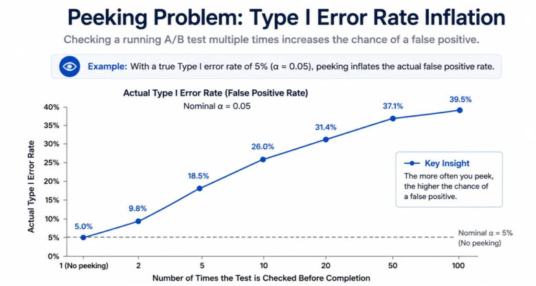
The peeking problem. Whenever you take a peek at the data from a trial test while it’s still being conducted, you increase your probability of committing a Type I error. If you do so 20 times, you can expect that at least one time you will see p < .05, even if there isn’t really any effect there. The solution? Simple and often overlooked.
The Statistics That Actually Matter in a DS Job
In reality, however, not everything listed above is used equally. Here is an honest ranking, not of what is taught in classes, but rather of what can be found in job listings, Kaggle kernels, and data science Stack Overflow posts.
Tier 1 — Use These Every Week
Descriptive statistics (almost everyday). Probability distributions, such as Normal, Poisson, and Binomial. Tests of hypotheses (p-value, significance level, confidence interval). Linear & Logistic regression. A/B testing. Correlation & Covariance.
Master them. The rest is just flavor.
Tier 2 — Use These in Specific Roles or Projects
Bayesian analysis (used in probabilistic modeling, natural language processing, and recommendation engines). ANOVA (if you’re doing a multi-variant experiment, or analyzing data from an experiment that’s structured). Time series statistics (if your data is ordered by time, as most production data is). Survival analysis (in case of churn modeling and health outcomes).
Tier 3 — Know They Exist; Look Them Up When Needed
Non-parametric test statistics such as Kruskal-Wallis. Derivations of exact probabilities using first principles. Independent analysis of kurtosis not involving risk or financial considerations.
No one would ever hope you remember these. But they will expect you to know how and when they will come into use.
Common Statistical Mistakes Data Scientists Make
I think this section is more useful than any advantages or applications list. Knowing when something goes wrong is half the skill — maybe more than half. These five mistakes are seen constantly in real DS work, and most tutorials don’t mention any of them.
Mistake 1: Data leakage. You’re predicting loan default. You accidentally include the account_closed flag as a feature. Your model hits 99% accuracy in training because future information about the outcome bled into the input. It’s a statistical error at its core: your training distribution doesn’t match your deployment distribution. The model learned a tautology, not a pattern.
Mistake 2: Assuming normality without checking. Fit a parametric test to heavily skewed data and your results are unreliable. Use scipy.stats.shapiro() on smaller samples or visualize a Q-Q plot before reaching for a t-test. If the data fails the normality check, use a non-parametric alternative.
Mistake 3: Statistical significance without effect size. You conducted an A/B test and got p=0.001. Wonderful. However, your CTR difference was 0.02%, based on a total of five million users. Significant statistically, but practically irrelevant. In all cases, whenever you calculate the p-value, always accompany it with an estimate of the effect size, such as Cohen’s d.
Mistake 4: Multiple comparisons without correction. When performing tests to assess the significance of 50 features at an α level of 0.05, you will typically see two to three false discoveries just due to random chance. Without using Bonferroni correction or false discovery rate correction, all of those false discoveries enter the model. Using Bonferroni correction requires only one line of code – simply divide α by the number of tests.
Mistake 5: Confusing correlation with causation in feature selection. Correlation
Included in the correlation discussion, but bears repeating here in light of model construction: variables that correlate with the target as they have a common cause will be predictive in the training set and degrade when deployed. Not an overreaction to include causal diagrams prior to feature engineering, as the most successful teams do.
How to Learn Statistics for Data Science (The Honest Roadmap)
Skip the formal textbook sequence for now. Start with intuition, build toward rigor.
Month 1 — StatQuest with Josh Starmer (YouTube). Distribution theory, hypothesis testing, every key concept – all are illustrated without a math background being necessary. Starmer apparently spent many years perfecting his presentation by observing confusion in his audience. It clearly paid off because this really is the best freely available resource out there for developing statistical intuition.
Month 2 — Real data on Kaggle. Choose a dataset that is within a business environment that you can comprehend. These include e-commerce, healthcare, or finance. Calculate all descriptive statistics possible on the dataset. Visualize the distributions of the data. Conduct a hypothesis test on a question that matters in the data set.
Month 3 — Naked Statistics by Charles Wheelan, then ISLR. Wheelan’s book contains the essence of all concepts explained without mathematics – easy to comprehend while commuting. Begin with An Introduction to Statistical Learning (ISLR), authored by James, Witten, Hastie, and Tibshirani. The e-book version is freely available on the web. This is precisely the point at which statistics learning meets machine learning.
Formal classes from sites like DataCamp or Coursera will suffice if one needs structure and deadlines. The reality, however, is that getting to practice coding on live data will yield more in terms of learning within each hour than a lot of structured classes.
Best Resources in 2026
| Resource | Best For | Cost |
| StatQuest — Josh Starmer (YouTube) | Visual intuition, all core concepts | Free |
| Kaggle Learn + datasets | Hands-on practice with real data | Free |
| Naked Statistics — Charles Wheelan | Intuition without heavy math | ~$15 |
| ISLR — James, Witten, Hastie, Tibshirani | Statistical learning theory | Free PDF |
| DataCamp Statistics track | Structured path with projects | Paid |
Statistics for the AI Era — What’s Changed in 2026
The term “perplexity” currently holds two distinct meanings within the context of a technical conversation. Traditionally, it has long been employed to quantify the efficacy of probability models. Now, however, as of 2026, it has become one of the main evaluation measures for large language models. One idea, two uses.
To put it plainly, LLM perplexity is an indicator of how surprising an ordered series of tokens is to the model. In cases where perplexity is low, the model found the sequence expected; in cases where perplexity is high, it did not expect it. This involves simple probability theory, but applied to transformers.
Now, here’s what this means to data scientists of 2026:
Model calibration is now an imperative in production, not a mere afterthought in research. Having a calibrated model simply implies that whenever your model produces a probability such as “80% confidence,” the reality will support this claim 80% of the time. Poorly calibrated models, which abound in deep learning, generate overconfident probability estimates that deceive decision-making processes.
Uncertainty quantification has transitioned from being covered in scholarly research articles to being incorporated into job specifications in mission-critical applications for AI. Conformal prediction, Bayesian neural nets, and Monte Carlo dropout are all statistical techniques used with deep learning. Knowledge of Bayesian probability theory is the key to comprehending these concepts.
Statistical tests for model fairness have become legal considerations in a number of jurisdictions. The EU Artificial Intelligence Act, among other such legislation, demands statistical proof that there is no discrimination when using artificial intelligence in recruitment, loan approval, and healthcare. Disparate impact analysis is applied statistics. Demographic parity and equalized odds are probability theory with teeth.
Statistics aren’t becoming less important as AI advances. It’s becoming more important, because the consequences of statistical errors now scale in ways they never did before.
Data Science Course
Program Highlights
✓ 6 Months Industry-Focused Program
✓ Live Classes by Industry Experts
✓ 15+ Real-World Projects
✓ Resume & Interview Preparation
✓ Placement Assistance
Skills You’ll Build
Python • SQL • Power BI • Statistics • Machine Learning • Generative AI
Frequently Asked Questions
Q1. What statistics should I learn for data science?
Ans. Begin with descriptive statistics, probability distribution (normal, binomial, Poisson), hypothesis testing, and regression analysis. They constitute most of your everyday data science activity. Incorporate Bayesian statistics, ANOVA, and time series statistics in your skill set as you advance in your career.
Q2. Is statistics hard for data science?
Ans. The math required isn’t overly difficult for what is typically needed. The tricky part is learning statistics intuitively – understanding when the findings have significance, when it’s merely correlation, when the sample is too small. This only comes with experience working with actual data sets rather than relying on formulas.
Q3. Do data scientists use statistics every day?
Ans. Certainly, although sometimes implicit. Every time you analyze data distributions, assess model metrics, conduct experiments, and determine whether or not a particular characteristic is valuable, you’re making a statistical assessment.
Q4. What’s the difference between statistics and machine learning?
Ans. Statistics is the mathematics of making sense of the data amidst uncertainties. On the other hand, machine learning comprises all those algorithms which learn patterns from the data in order to predict something. In other words, ML relies on statistics; the distinction between the two becomes blurred with respect to logistic regression and Bayesian inference, among others.
Q5. What Python libraries are used for statistics in data science?
Ans. NumPy for arrays and basic statistics. SciPy for advanced statistics and distributions. Pandas for data wrangling and exploration. Statsmodels for regression and time series modeling. Scikit-learn for statistical machine learning.
Q6. How long does it take to learn statistics for data science?
Ans. It takes you about 2-3 months to be able to understand tier one concepts with daily practice. Mastery will take many years to achieve through practical application of statistics in the field and not just classroom studies.


