


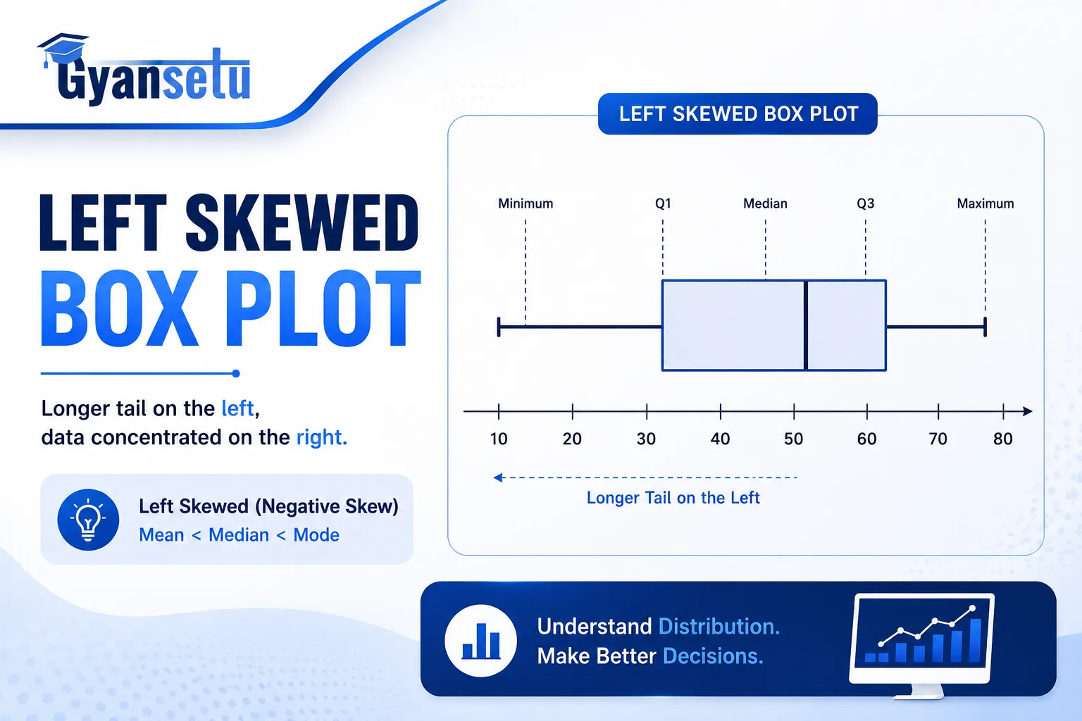
Students of statistics will probably memorize “negatively skewed,” look at the picture of a box plot that seems to slant to the right, and wonder what mistake they made. They made none. However, the vocabulary really does seem backward, and I can find virtually no textbook that addresses the problem.
That’s because the word for the skew refers to which way the tail points, not the location of the main body of data. The body of the distribution is on the right. The tail points to the left. So “left skew” applies to the tail, but when people see that large concentration of data on the right, their mind recoils.
In this article, we begin by clarifying the confusion before showing how to interpret a left-skewed box plot using several examples, comparisons, and Python code.
What Will I Learn?
What “Skewed Left” Actually Means (and Why the Name Trips People Up)
“Negative skew” is simply another name for “left skew.” Same idea, different terms. Actually, this is one of those concepts in which statistics decide to choose a term and run. That’s right, students were a little bit confused after that.
In case of a left skew, some low values pull the graph in the direction of the low end of the spectrum. They are rare occurrences, and they make the distribution tail stretched to the left side, while the rest of the points are on the other end.
Box plot was invented by John Tukey, who was at Princeton University in 1977, per the NIST/SEMATECH Engineering Statistics Handbook.. In the book “Exploratory Data Analysis,” which he published in 1977, there’s no mention whatsoever explaining why he called the tails of the distribution whiskers. The point is that whiskers describe the tails of the box-and-whisker plot.
Definition for quick reference: In a left skewed distribution, there is a tail extending to the lower end, with the bulk of the data lying on the right-hand side.
“Negative skew” and “left skew” are both technically correct. Whichever term you prefer can be used.


Data Science Course
Program Highlights
✓ 6 Months Industry-Focused Program
✓ Live Classes by Industry Experts
✓ 15+ Real-World Projects
✓ Resume & Interview Preparation
✓ Placement Assistance
Skills You’ll Build
Python • SQL • Power BI • Statistics • Machine Learning • Generative AI
What a Left-Skewed Box Plot Looks Like
Here’s the thing about identifying left skew visually: you check two places on the plot. If both of them point in the same direction, you’ve got your answer with confidence.

The Longer Left Whisker Rule
The left tail extends further out from the box compared to the right tail. The line symbolizes the spread of the values in the lower quartile of your data set; when there are some extreme outliers on the bottom side, then the whisker extends outward towards them.
This is often one of the first things that catch your eye when looking at a box plot and trying to identify skew.
Where the Median Line Sits
In a left-skewed box-and-whisker plot, the line for the median does not lie in the middle of the box. It is positioned closer to Q3.
This is because there are more values on the higher side of the distribution, and since the value that divides the data in half lies in the higher range, the line for the median is positioned towards the top of the box.
Mean vs. Median — and What the Gap Tells You
This is where the test score scenario proves more useful than all charts.
Consider this set of data: 95, 92, 91, 90, 88, 85, 41, 32. Median = 87 (the midpoint of arranged set). Mean = (95 + 92 + 91 + 90 + 88 + 85 + 41 + 32) ÷ 8 = 76.75. Those two outliers pulled down the mean by
Mean < Median is the key formula for negative (left) skew
That left whisker of yours indicates the 41s and 32s, while the median line right around the third quartile illustrates how well most of the students have performed. If you were to consider the mean, which, mind you, is not directly represented by any feature on your box plot, it would fall somewhere left of the median line.
In case you are wondering what is that gap between the mean and the median, it serves as an indicator for measuring how skewed the data set is.
Left Skew vs. Right Skew vs. Symmetric — Quick Comparison
This table is the one no competing article bothered to build. Keep it open while you practice reading box plots, which sounds obvious until it isn’t — until you’re looking at actual data under a deadline and second-guessing yourself.
| Type | Tail Direction | Longer Whisker | Median Position | Mean vs. Median | Real Example |
| Left Skew (Negative) | Points left → low values | Left whisker | Near Q3 (right end of box) | Mean < Median | Exam scores on an easy test |
| Symmetric (Normal) | No tail | Equal length | Centered in box | Mean ≈ Median | Adult heights |
| Right Skew (Positive) | Points right → high values | Right whisker | Near Q1 (left end of box) | Mean > Median | Household income |
One thing worth adding: the word “negative” in negatively skewed refers to the sign of Pearson’s skewness coefficient — a negative number — not to anything problematic about the data itself.
Also, The reason left skew and right skew look mirror-opposite in the table is because they are. If you can read one, you can read the other by flipping every rule.
Real-World Examples of Left-Skewed Data
Surprisingly, left skewness is more rare in nature than right skewness. This is because most variables in nature have a lower bound of zero, with no upper bound – income, time, size, or count for instance – and thus the natural imbalance results in a right skewed distribution. The left skew requires the reverse arrangement: an upper bound with just a lower tail.
This is when you will see it:
Easy exam grades. If the test difficulty is set lower than the capabilities of the students taking it, then the majority will get a grade between 85 and 100. A small fraction will perform very poorly. The distribution will be characterized by a long left tail, a median of around 90, and a mean dragged down to between 75 and 80.
Time to produce failure in quality control. In a properly manufactured batch of products, most items will have about the same life expectancy as specified in the design; a minority of defective items will fail early. The box plot will show a long left whisker due to those early failures, and most observations on the right-hand side. Industrial quality control observations are usually right-skewed when looked at in terms of time to failure, but when viewed in terms of the remaining life compared to design specifications, the observations are left-skewed.
Age of death in developed nations. In most cases, people who live in developed countries pass away between ages 70 and 80 years old. Early deaths tend to affect the distribution on the left side, although this has become much shorter due to improvements in childhood mortality rates.
Batting average for professional baseball players. The majority of batting average scores fall in the range of .250-.290. Players whose scores drop below .200 are outliers because they remain part of the lineup despite poor performance. Most of the box score is filled with scores toward the right end.
How to Create a Left-Skewed Box Plot in Python
However, in actuality, you would get a better understanding of the concept of skewness by creating it rather than reading about it. The following script makes use of scipy.stats to generate a skewed distribution that is clearly skewed towards the left, after which the boxplot is drawn out with the mean and median labeled.
Python

import numpy as np
import matplotlib.pyplot as plt
from scipy import stats

# Beta(a=5, b=2) clusters values near 1.0 (the high end)
# and trails off toward 0 -- clean left skew
np.random.seed(42)
data = stats.beta.rvs(a=5, b=2, size=500)

fig, ax = plt.subplots(figsize=(9, 4))
ax.boxplot(data, vert=False, patch_artist=True,
          boxprops=dict(facecolor='#d0e8f5'))

# Mark mean and median so the gap is visible
ax.axvline(x=np.mean(data), color='red',
          linestyle='--', linewidth=1.5,
          label=f'Mean: {np.mean(data):.3f}')
ax.axvline(x=np.median(data), color='blue',
          linestyle='--', linewidth=1.5,
          label=f'Median: {np.median(data):.3f}')

ax.set_xlabel("Value")
ax.set_title("Left-Skewed Box Plot -- Beta(5, 2) Distribution")
ax.legend()
plt.tight_layout()
plt.show()

# Confirm the skew direction numerically
print(f"Mean:     {np.mean(data):.4f}")
print(f"Median:   {np.median(data):.4f}")
print(f"Skewness: {stats.skew(data):.4f}")  # Negative = left skew
Your output should look something like:Mean: 0.7097, Median: 0.7272, Skewness: -0.5731. Note that the mean is printed after the median and that the skewness value is a negative number, indicating left skew.
For the right skew, reverse the parameters to a=2, b=5. When viewed side by side, it is clear how the two types of skew are inversely related. This is something that cannot be completely expressed with words alone.

Common Mistakes When Reading a Left-Skewed Box Plot
To be fair, these errors are easy to make — even people who work with data regularly fall into them when moving fast.
Mistake 1: Thinking the data is “on the left” because it’s called left-skewed.
Opposite direction. The values are on the right. The skew (tail) is on the left. The name is in relation to tail, not the group. If you’re still confused, think about it like this; skew is related to the direction of pull, not its origin.
Mistake 2: Treating a long left whisker as automatic proof of left skew.
However, it’s not quite that simple. One single extreme value on the lower side may elongate the left whisker without the entire distribution having a left skew. Also consider the placement of the median within the box plot. If the median is positioned about halfway through the box yet there is an extended left whisker, then a possible symmetric distribution with one outlier may exist.
Mistake 3: Trusting a small-sample box plot.
Box plots are much more informative as the size of the data increases; n=30 is usually considered to be a practical minimum for applying statistical summary measures, where higher sizes yield much more reliable results. There is no exact figure of minimum data in the literature. With only 12 points, one could get an apparently asymmetric box plot, although that doesn’t mean much at all.

Data Analyst Course
Average time: 6 months
Skills you’ll build: SQL, Python for Data Analysis, Power BI, Excel with AI, Data Storytelling, Stakeholder Reporting
What Left Skew Means for Your Data Analysis
In short: it means that your central tendency value is misleading.
There was once an analyst who calculated the mean for clearly left-skewed data and found the typical value that was not present in their data at all, thanks to low-end outliers pulling the mean value down to where there’s only a tiny bit of data. This is what happens if you’re misled by your central tendency value.
If you have left-skewed data, then use the median instead of the mean to represent its center. Unlike the mean, the median will tell you exactly where the majority of your data lies because it cannot be influenced by outliers.
The standard recommendation from most statistics classes is not to calculate the mean for skewed data. This is a bad way to frame this problem because you should view the mean and median together as a set of indicators of your data symmetry (or lack thereof). When these values are close to each other, your data is relatively symmetrical and either can be used as a central tendency measure. However, when the difference between the two measures becomes apparent, especially in favor of the median, then this difference is informative.
Two more practical points:
Parametric tests may not apply. A significant left skew may invalidate the assumption of normal distribution, which is a requirement for t-test, ANOVA, and Pearson correlation tests. In such cases, you may have to consider using a nonparametric test or applying transformations before doing the analysis.
Log transformation doesn’t fix the left skew. Logarithmic transformation fixes right-skewness very well. The usual way to deal with left-skewed data is by reflection—subtracting all values from the highest value and taking logs of the reflected values. It may not look very elegant, but it gets the job done. The reflected data is right-skewed, and the logs fix that.


