


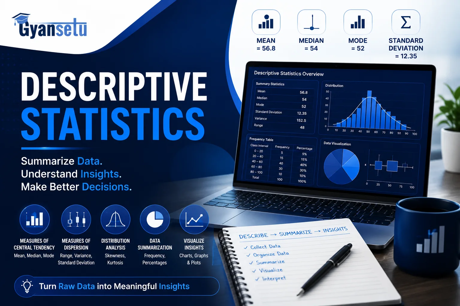
Most people who’ve taken a statistics class can tell you what a mean is. Almost none of them can tell you when NOT to use it — and that gap causes real problems in real data work.
Descriptive statistics are numerical summaries that describe the key features of a dataset without making predictions beyond the data itself. They answer one question before any analysis begins: what does my data actually look like?
But the formulas are only half the skill. The other half is knowing which measure fits which situation, and why the wrong choice can send every decision downstream in the wrong direction. That’s what this guide covers.
What Will I Learn?
What Are Descriptive Statistics?
Descriptive statistics summarize what happened in a dataset. They don’t predict what will happen next. They don’t test whether two variables are connected. They just describe.
Here’s the thing most analysts miss: treating descriptive statistics as a box to check before the “real” analysis starts is exactly the kind of thinking that produces bad reports. A weak descriptive summary poisons every analysis step after it. You need to know your data’s shape before you do anything else with it.
Descriptive vs. Inferential Statistics
Descriptive statistics describe the data you already have. Inferential statistics use a sample to draw conclusions about a larger population you haven’t fully measured.
A city counts the average age of residents in a neighborhood survey — that’s descriptive. A researcher uses that survey to estimate the average age of the entire city’s population — that’s inferential. These two types answer fundamentally different questions and carry different levels of uncertainty. Descriptive statistics carry none: they describe exactly what was measured, no more.

Data Science Course
Program Highlights
✓ 6 Months Industry-Focused Program
✓ Live Classes by Industry Experts
✓ 15+ Real-World Projects
✓ Resume & Interview Preparation
✓ Placement Assistance
Skills You’ll Build
Python • SQL • Power BI • Statistics • Machine Learning • Generative AI
The Three Types of Descriptive Statistics
Every descriptive measure falls into one of three buckets. Where does your data center? That’s central tendency. How spread out is it? That’s variability. How often does each value appear? That’s frequency distribution.
In practice, though, none of these three works well alone. A mean without a standard deviation tells you where the center is but not whether the data is tightly packed or scattered across a wide range. A frequency distribution without a central tendency measure shows you a shape but not where it sits. You need all three to build an honest picture of your data.

Measures of Central Tendency — Mean, Median, and Mode
Use this dataset throughout this section: the ages of seven employees at a small company — 22, 25, 26, 28, 31, 34, and 67. That last number is the founder, who joined as a second career after retiring from teaching. He skews everything.
Mean adds all values and divides by the count. Here: 233 ÷ 7 = 33.3 years. Only one person in the group is actually older than 33.3. The mean is technically correct and practically misleading.
Median is the middle value when data is sorted. With seven values, the fourth is the median: 28 years. That number actually represents where the team clusters.
Mode is the most common value. In this dataset, every age appears exactly once — so there is no mode. Forcing a mode answer on data like this tells you nothing.
Three measures. Three different answers. All of them technically correct.
When to Use Mean vs. Median vs. Mode
Start with a real situation. Then work backward to the rule.
The U.S. Census Bureau reports median household income, not mean, as confirmed in its Income in the United States: 2024 report.. Why? Because a small number of extremely high earners drag the mean upward, making typical American households appear wealthier than they actually are. In recent data, the gap between mean and median household income in the U.S. exceeded $20,000. That entire gap is caused by outliers at the top.
So: use the mean when your data is roughly symmetric and no extreme values are pulling it off-center. Heights of adults in a large population, weekly hours worked by salaried employees — these suit the mean well.
Use the median when your data is skewed or has outliers. Income, home prices, customer response times in software — the median gives a more honest read of the typical value in each case.
Use the mode for categorical data, or whenever “most common” is genuinely the right question. A clothing store tracking which size sells most — S, M, L, XL — can’t calculate a mean. Mode is the only measure that applies there.
Decision rule: Symmetric data, no outliers → mean. Skewed data or outliers present → median. Categorical data or “most popular” questions → mode.

Measures of Variability — Range, Variance, Standard Deviation, and IQR
Two datasets can have identical means and look completely different. That’s why variability measures matter just as much as central tendency.
Range is the fastest calculation: subtract the smallest value from the largest. In the employee dataset: 67 − 22 = 45 years. Fast to calculate; sensitive to every extreme value in the dataset.
Variance is the average squared distance of each value from the mean. It’s the mathematical foundation for standard deviation, but its units are squared — years², in this case — which makes it hard to interpret directly.
Standard deviation is the square root of variance, which brings the number back into the same units as the original data. For the employee dataset, standard deviation is roughly 14.8 years. That means, on average, employee ages fall about 15 years away from the mean.
IQR (Interquartile Range) is Q3 minus Q1 — the width of the middle 50% of the data. It ignores the top and bottom 25% entirely. For the employee dataset: Q1 = 25, Q3 = 34, IQR = 9 years. That number describes where the core of the team actually sits without the founder’s age pulling the spread out of shape.
When outliers are present — and in real data, they almost always are — IQR is often more honest than standard deviation.
Skewness and Kurtosis — The Shape of Your Data
Every introductory statistics resource lists these two terms. Weirdly enough, almost none of them explain what to do with the information. Here’s what you actually need to know.
Skewness describes which direction a distribution’s tail points. Positive skew means the tail stretches right: most values cluster on the left, with a few very high outliers pulling the average up. Income distributions are positively skewed. Negative skew is the reverse — the tail points left, most values sit toward the higher end, and a few very low values drag the mean down.
A roughly symmetric distribution has skewness near zero. That’s where the mean is a trustworthy summary. When skewness is strong in either direction, the median tells a more accurate story. This is why skewness isn’t just academic — it directly tells you which central tendency measure to report.
Kurtosis measures how heavy the tails of a distribution are compared to a normal distribution. High kurtosis means more extreme values than expected; low kurtosis means fewer. For most general data work, skewness is the more immediately useful of the two. Kurtosis matters most in fields where tail events carry serious consequences, like financial risk analysis.

Frequency Distribution — Counting What Happens
A frequency distribution shows how often each value — or range of values — appears in your dataset.
Three versions exist. Raw frequency is the count: 14 employees worked exactly 40 hours last week. Relative frequency converts that to a proportion: 14 out of 50 employees = 28%. Cumulative frequency adds each percentage to the running total, showing what share of data falls at or below each point.
Histograms visualize frequency distributions with bars: each bar represents a range of values, and bar height shows how many data points fall in that range. A roughly bell-shaped histogram suggests approximately normal data — the mean will work well. A heavily one-sided histogram signals skew — reach for the median.
How Outliers Affect Descriptive Statistics
Add one person to the employee dataset: an 89-year-old co-founder who still comes in on Tuesdays to review quarterly numbers.
The mean jumps from 33.3 to 40.3. The median moves from 28 to 29.5. The IQR barely shifts.
That’s not a quirk — each measure is doing exactly what it was built for.
Two methods are used to identify outliers before they distort your analysis. The Z-score method flags any value more than 3 standard deviations from the mean. The IQR method flags values below Q1 − (1.5 × IQR) or above Q3 + (1.5 × IQR). The IQR method holds up better on skewed data; the Z-score method works better when the distribution is roughly normal.
Weirdly enough, the instinct most analysts have when they see an outlier is to delete it. Resist that. An outlier might be the most important data point in the dataset — a fraud case, a record sale, a manufacturing defect that slipped through quality control. Removing it without clear justification and documentation isn’t careful analysis.
It’s manipulation.
Descriptive Statistics in Practice — A Full Worked Example
Ten customer purchase amounts from an e-commerce store’s Tuesday orders:
$12, $18, $22, $25, $27, $31, $34, $38, $45, $290
The short answer is: that $290 is a bulk order, and it’s about to illustrate why descriptive statistics require judgment, not just calculation.
| Measure | Value | What It Tells You |
| Mean | $54.20 | Pulled hard by the $290 order |
| Median | $29.00 | The typical customer transaction |
| Mode | None | Every purchase amount is unique |
| Range | $278 | Driven almost entirely by that one order |
| Std. Dev. | ~$79.40 | High — the $290 outlier inflates it |
| IQR | $19.50 (Q1=$22, Q3=$41.50) | Where the middle 50% of orders actually land |
Run df.describe() in Python’s pandas library and you get all of this in one output — count, mean, standard deviation, min, Q1, median, Q3, and max. Excel’s Data Analysis ToolPak returns a nearly identical summary: Data → Data Analysis → Descriptive Statistics, and the table appears in seconds.
Now read the numbers together. The marketing team sees a mean order of $54.20 and builds a campaign targeting customers who spend $50 or more. But the median says $29 — that’s where typical buyers actually sit. The mean is an artifact of one bulk order. A campaign built on it would reach the wrong customers entirely, and the gap between $54 and $29 is the exact cost of not reading your descriptive statistics properly.

Tools for Running Descriptive Statistics
To be fair, every tool on this list produces roughly the same core output. The real differences come down to what environment you work in, how much code you’re willing to write, and what your organization expects you to use.
Excel — Data Analysis ToolPak. Go to Data → Data Analysis → Descriptive Statistics. The output table includes mean, standard error, median, mode, standard deviation, variance, range, min, max, count, and confidence level — one click, no code. Excel is absent from almost every online statistics tutorial despite being the most widely used descriptive statistics tool in business settings. That’s a real gap in how this topic gets taught.
Python — pandas .describe(). One line of code across your entire dataset. Works simultaneously on every numeric column. Standard starting point for data science and machine learning pipelines.
R. Preferred in academic and statistical research. The psych package’s describe() function returns skewness and kurtosis by default — something pandas doesn’t do out of the box.
SPSS. Dominant in social science, psychology, and healthcare research. Point-and-click interface; no code required. Widely used in academic research environments where reproducibility matters but coding isn’t required.
SAS. Enterprise standard in pharmaceutical research, finance, and regulated industries. Required by certain compliance frameworks.
Stata. Standard in econometrics, public health, and policy research. Cleaner syntax than R for working with longitudinal datasets.
Right.
Common Mistakes When Interpreting Descriptive Statistics
Most articles on this topic get this exactly wrong — they spend all their space on formulas and none on where real analysis breaks down. I’ve seen the second mistake below appear in published academic papers, which is a problem that should concern anyone who reads statistics-based research.
Here are the four that show up most consistently, which sounds obvious until it isn’t the moment you’re the one who built the report and someone asks why the numbers don’t match reality.
Mistake 1 — Using the mean on skewed data. If your data has strong outliers or skew, the mean misrepresents the typical value. Report both the mean and median, then explain why they differ. The size of that gap is itself informative — a large gap signals that outliers or skew are doing heavy lifting in your data.
Mistake 2 — Confusing standard deviation with standard error. Standard deviation describes how spread out your data is. Standard error describes how precisely you’ve estimated the mean from a sample — a measure of sampling uncertainty, not data spread. They answer different questions, and conflating them quietly changes the interpretation of your results.
Mistake 3 — Removing outliers without documentation. Every removal decision needs a method (Z-score? IQR?), a threshold, and a written justification. Without that, you’ve shaped the data to match your expectations rather than the other way around.
Mistake 4 — Presenting frequency counts without sample size. “3 out of 4 customers preferred our new design.” If n = 4, that figure is statistically meaningless and probably shouldn’t appear in any report. Sample size is part of the description — leaving it out turns a data point into a persuasion tactic.

Data Analyst Course
Average time: 6 months
Skills you’ll build: SQL, Python for Data Analysis, Power BI, Excel with AI, Data Storytelling, Stakeholder Reporting
Frequently Asked Questions
Q1. What is the main purpose of descriptive statistics?
Ans. Descriptive statistics summarize the key features of a dataset — its center, spread, and shape — so the data can be understood before any conclusions are drawn. They’re the required first step in any serious data analysis. Without them, every analytical step that follows is built on assumptions rather than evidence.
Q2. What is the difference between descriptive and inferential statistics?
Ans. Descriptive statistics describe the data you have. Inferential statistics use a sample to draw conclusions about a larger population. Descriptive statistics carry no uncertainty about what they measure — they describe exactly what was observed. Inferential statistics always carry uncertainty because they’re making claims beyond what was directly measured.
Q3. When should I use the median instead of the mean?
Ans. Use the median when your data is skewed or contains outliers. The median isn’t moved by extreme values; the mean is. The clearest signal: when your mean and median are meaningfully different, use the median to describe the typical value and note the mean separately to flag the effect of outliers or skew.
Q4. What tools are commonly used for descriptive statistics?
Ans. The six most widely used tools are Excel (Data Analysis ToolPak), Python via pandas, R, SPSS, SAS, and Stata. Excel is the most common in business and financial settings; pandas is standard in data science; SPSS dominates social science and healthcare research. Excel is absent from most online statistics tutorials despite being the tool most professionals actually reach for first.
Q5. Can descriptive statistics be used for categorical data?
Ans. Yes — but only certain measures apply. Mode and frequency distribution both work for categorical data. Mean and standard deviation require numeric values and can’t be meaningfully calculated on categories like product type, job title, or geographic region. If your data is categorical, frequency counts and relative frequencies are your primary tools.


